

Some Overlapping Lines of Type on John Furnival
The following memories and reflections were written in response to news of the death of distinguished poet, educator and artist John Furnival on 31 May 2020.
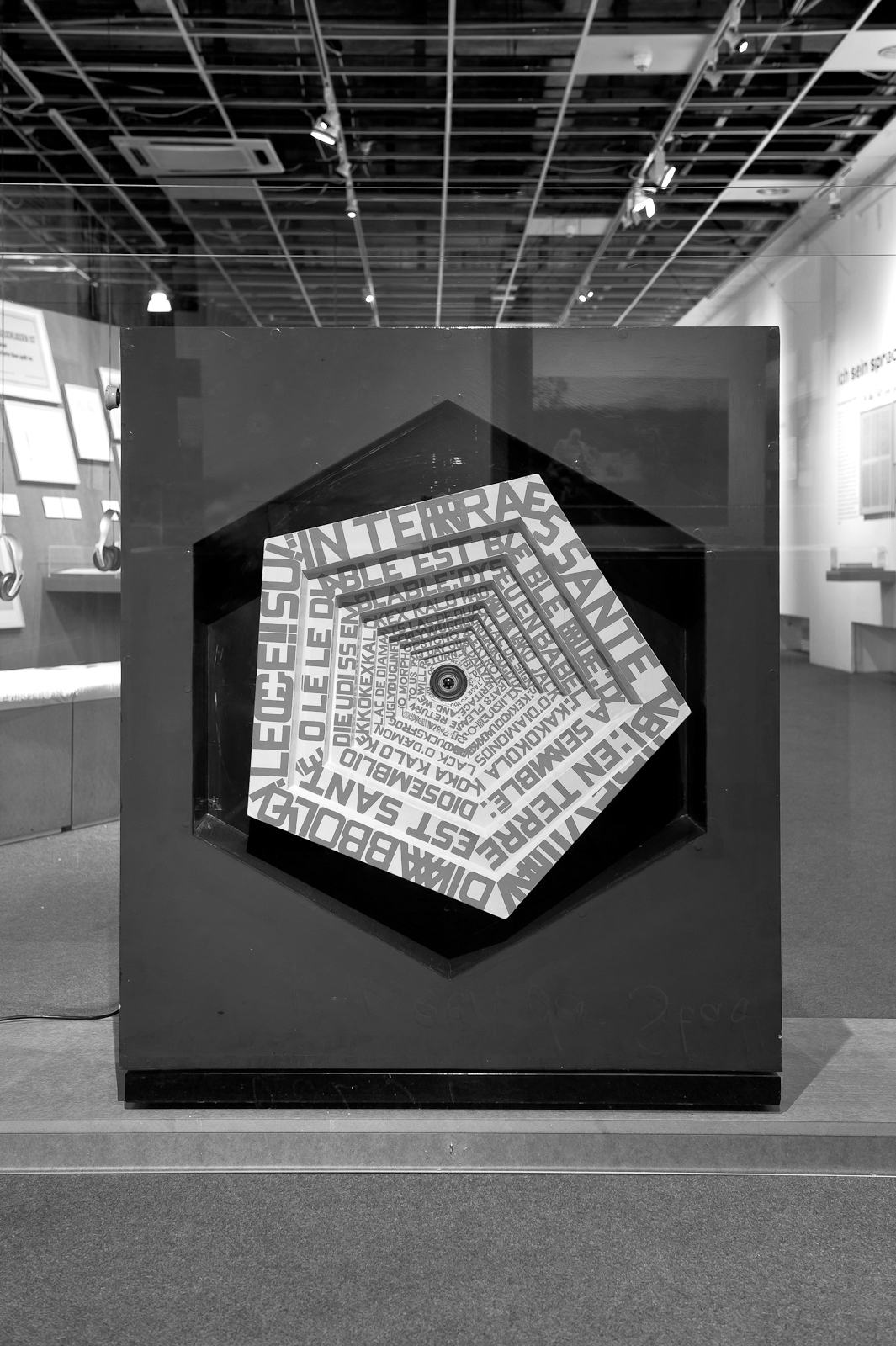
John Furnival, 'Devil Trap' (1965)

John Furnival, 'Following in Nature's Footsteps' (1980)
John Furnival, 'Babacus' (c.1964)
John Furnival (1933-2020) was a text-artist who contributed significantly to the concrete poetry movement of the 1950s-70s. I only met him once, in 2012, but his work has had a significant impact on my own work as a writer and critic. A product of the Royal College of Art and the late-1950s heyday of British pop art, John incorporated his interests in text and image, post-war consumer culture, literature, myth, and wordplay into a series of dazzling text-based murals and other artworks from the early 1960s onwards. Although these were primarily recognised as contributions to the international movement of concrete poetry, as Moxham noted in his recent obituary (The Guardian, 17 June 2020), John was never entirely comfortable with the label.
John spent most of his life in the West Country, teaching at Bath Academy of Art in Corsham from around 1960, and making contact with many of the denizens of the concrete poetry movement, including Dom Sylvester Houédard, Ronald Johnson, and Ian Hamilton Finlay. He also worked collaboratively with his partner, Astrid Furnival.
***
I first came across John’s work when I was an MPhil student studying twentieth-century literature at Cambridge University in 2008-09. I was 23 and I spent a lot of time reading French critical theory. I got into concrete poetry because it seemed to provide a way of stepping back from all that: stepping back from language, getting some distance on it without using semantics as the tool for doing that (which just seemed to push you further into the mire): stepping back and laughing, or taking pleasure in the way words looked. Here’s the language. Look at it. It’s just matter. But it’s beautiful. I was leafing through Emmett Williams Anthology of Concrete Poetry in the University Library one day and came across these pages full of clustered rows of letters, spelling out phrases in a mixture of languages ‘til they were overprinted to the point of illegibility; extending up the page and overlapping with each other in curves and clouds; forming mad gradients and patterns; towering and bursting, twisting and looping back on themselves. I couldn’t work out if it was printed or typed: it had this gorgeous mixture of fluidity and precision about it. I loved the way it looked, more than anything else in the anthology apart from maybe the dsh typestracts. I had no idea how to place it. I was pretty sure I couldn’t write my coursework essay about it, but it was the best expression of that language-as-matter idea (or feeling) that I found very grounding at that time. I imagined the guy who had made it (who I’d never heard of but whose surname I liked the sound of and remembered) had had a lot more fun making his work than most of the authors I was studying. When I looked closer there were puns and wordplay buried in it, clichés reworked and interrogated, a spirit of irony coursing through it; it was smart without trying to be smarter than you.
Shortly afterwards I wrote an essay on Bob Cobbing, and off the back of that ended up writing a PhD (and later a book) on concrete poetry in Britain. I started writing to John in about 2010 and I got letters back in a cramped, spidery cursive with lots of crossings out. The tone was friendly, avuncular (the word that always comes to mind first when I think about the impression I got of John); happy to help but not overly fussed with dates and details (avoiding most questions which broached them too directly); snippets of a bohemian, peripatetic lifestyle spread between the West Country and France. Letters posted in repurposed plastic window envelopes from banks (an idea I use now). One got sent to my parents’ house by mistake. Based on the letter my dad assumed it was from one of my student friends: some endearingly scruffy youngster with a whimsical sense of humour who couldn’t afford envelopes.
The letters led to a meeting on 15 May 2012, just over eight years ago. Train to Stroud (I think). John picked me up at the station: big colourful jumper full of holes, neckscarf, and chequered padded shirt underneath. Scruffy trousers. Very comfortable feeling around John. Not smiley but friendly. I’d forgotten my Dictaphone, which was incredibly stupid, but he brushed it off and we chatted at his kitchen table while I made notes. Astrid came in and out and joined in the discussion occasionally, as did a guy who was helping them do up the house. I think a son (?) arrived at one point. It seemed to me like a family home and a studio at the same time. Work was all over the place and we looked through it all. I have photos of loads of it, images I aim to come back to. Lots of little anecdotes that have stuck in my head: Dom Sylvester Houédard had no idea how money worked (you couldn’t send him off with change for the bus because he didn’t know how to use the coins); if Bob Cobbing hadn’t existed you’d have had to invent him; back-to-the-land sixties philosophy was rubbish because living in the country was ‘bloody hard work’; making fake road signs with question marks on and sticking them on the ring roads to confuse commuters; fell out with Ian Hamilton Finlay because John wouldn’t go to meet someone off a train and punch him in the face on Finlay’s behalf.
Some summary thoughts: I love John’s work and it’s really important to me. I didn’t know John at all but writing this I realise that he made a clear impression on me; the family dynamic in the house seemed really lovely; John was very funny when I met him. He looked like he was about to make an ironic remark the entire time, and he seemed to have instinctively satirical take on the world that wasn’t brittle or nihilistic, a bit world-weary perhaps, but with something positive underlying it. Finally, meeting John confirmed my theory that creative people seem young however old they are.
Dr Greg Thomas
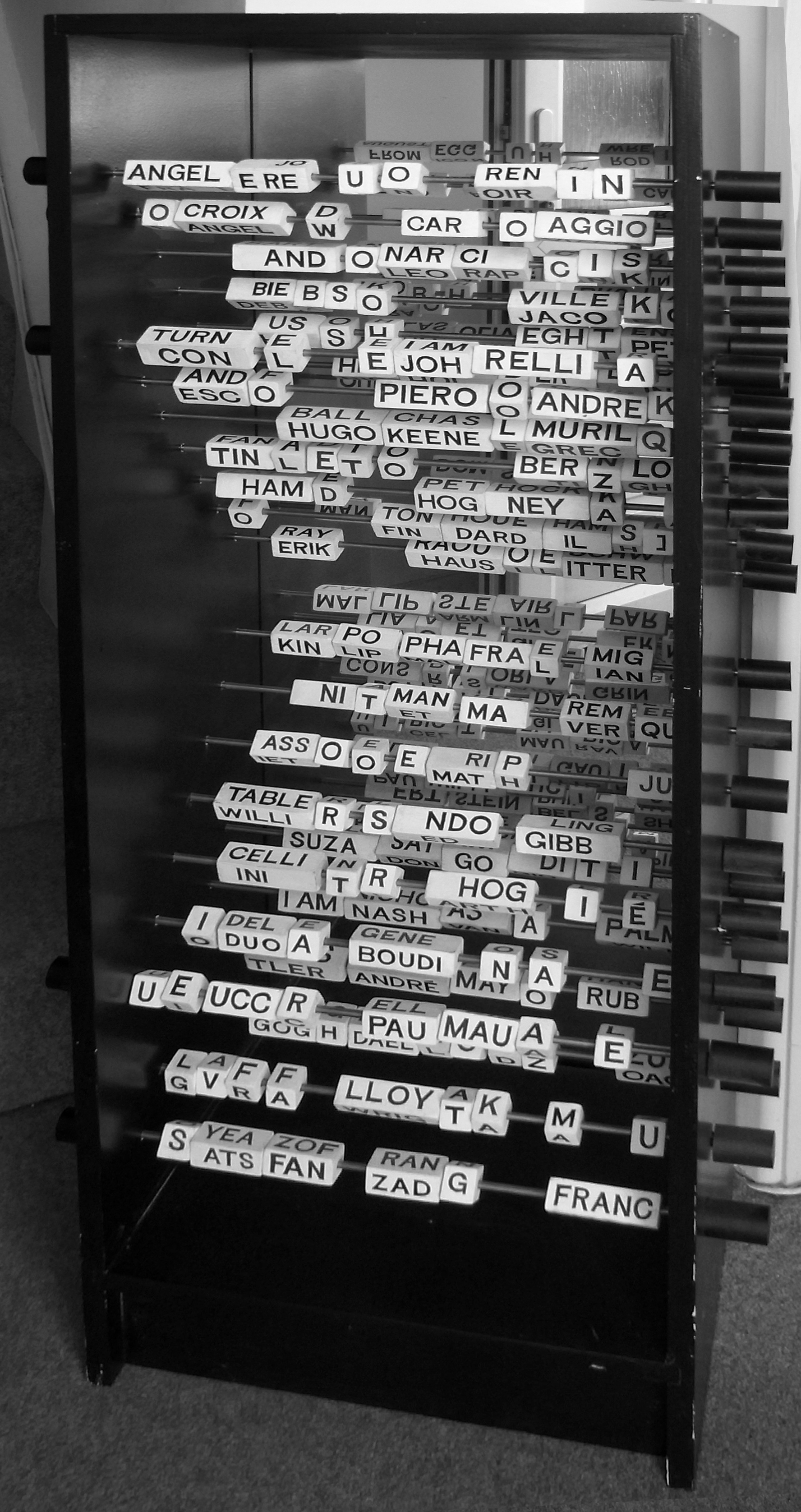
John Furnival is the master of the long, enquiring line. It reaches across The rooftops of Kensington Gore, his ambitious five panel early drawing. It resourcefully fills the pages of Poor. Old. Tired. Horse No 13. It builds up letters in Indian ink into the precarious structure that will lead to The Fall of the Tower of Babel.
Yet mastery is less useful as display than as trust. Even in the most bravura performances, or perhaps particularly there, where the stakes are higher, the drawings give themselves to the page or proliferate across separate panels, rising up and spreading out, tentatively but surely, always unpredictably, feeling their way into the available space. Instead of the logical progression we associate with concrete poetry, there is usually a large measure of improvisation in any Furnival drawing. It is not so much a question of the artist taking a line for a walk as allowing the line to take the lead. Every Furnival drawing is botanical in this strict sense of growing through itself towards itself, to the discovery of itself. Character is a quality of line.
For a few months (in 1969 or 70) I lived in the basement of John and Astrid’s rambling and hospitable house at Rooksmoor in Gloucestershire. After a day of teaching, John would come into the room and work quietly on a large word painting, talking and joking with me in his laconic way as he worked. He started at one side of the painting and carried on across the canvas until he came to the other end.
Thomas A. Clark
John Furnival privileged the laugh over the tear. To provide an example: John Cage came to stay briefly with the Furnivals, ostensibly to talk about their mutual interest in the life and works of the Franco-Scottish composer Erik Satie. During the course of the evening meal, John F tried to persuade John C that one could press hard on an egg in a particular direction without breaking the shell. To demonstrate this ‘scientific fact’, John F pressed on an egg above the head of John C. It broke…the slimy contents dribbling down the face of John C. After 30 seconds of shocked silence (it should have been 4’33”), the two Johns burst into laughter and the evening continued in high spirits.
John was intrigued by matters scientific, always asking me about my research and about the veracity of scientific reports appearing in the media. Knowing that I taught the philosophy of science, he was especially interested in quizzing me about how science ‘worked’. I had asked John to produce a pen and ink drawing on a white painted panel for my bedroom. Without knowing much about what he was contemplating, he asked me to provide articles from Nature scientific journal. Once completed, I was invited to inspect the drawing. It featured a maze (a frequent and favourite theme) that extended to the horizon and that was composed of fragments of Nature articles. From within this labyrinth of scientific jargon appeared trees composed of fragments from popular newspapers. Scurrying through the maze, amidst imagery depicting a seeker after Alchemical knowledge, was a portrait of myself chasing my wife who, representing Nature red in tooth and claw, was carrying a large knife. The work, entitled Following in Nature’s Footsteps, still greets me each morning!
John Furnival disliked the concept of ‘masterpieces’, but there is no doubting that his large screens comprised of ‘wordscapes’ in pen and Indian ink were very special. John was never sure how many screens he had produced (I estimate 14) and his intention was to have then all assembled together to form a large maze; a forlorn hope, given that they are spread across the globe! His last screen, still present in his studio, is titled Protestations. It is probably one of the most serious (contra-humorous) works that John has ever produced, featuring a Ziggurat made up of newspaper articles about demonstrations and rebellions and, in the form of words, the collapsing twin towers of the New York World Trade Center. I never had the privilege of watching John work on a screen and I put it to him that they must have involved a great deal of pre-planning. ‘Piffle’, came his response, ‘I have a general notion of what a screen should look like but it’s essentially improvised’. That he could take in such schemes, and the detail required to produce such cogent imagery, is remarkable. But his comments are not to be doubted. There are those fortunate enough to have seen him working on a panel that is laid flat on the floor or on a table with John sprawled upon it, drawing systematically, and almost automatically, from the upper edge to its bottom edge.
Music played a very important part in John Furnival’s life. In 1975, he founded Satie’s Faction (pun intended), which brought together musicians and artists to celebrate a composer that, at that time, was hardly heard of (except as background for toilet paper adverts). John also collaborated with Hugh Davies (a one-time assistant to Karlheinz Stockhausen) in producing instrumentation that they called Shozygs (instruments made from discarded materials and named from the final volume of an encyclopaedia whose content ranged from SHOal to ZYGote). John even composed a piece performed by the experimental ensemble, Gentle Fire. A must for John every week was a listen to Desert Island Discs. We would then meet and score the person interviewed and their choices out of 10! Both of us always appreciated choices that were catholic in taste and lamented the fact that track choices seemed to belong exclusively to popular music. Soon, we started extending the concept to other domains. These are John’s 8 Desert Island Books:
No. 1 The Complete Essays of Montaigne
No. 2 The Oxford English Dictionary
No. 3 The Diary of a Nobody
No. 4 The Poetry and Sermons of John Donne
No. 5 Lewis Carroll’s Alice books
No. 6 The Poetry of WH Auden
No. 7 The Complete Works of T.S. Eliot
No. 6 The Complete Works of Shakespeare
When I questioned John about this list he commented: ‘I don’t regularly read poetry, but I thought that it might give me more to ponder on than prose! I’m having to eliminate the poetry of Andrew Marvell, alas, because I definitely need the Alice books...I’d take Joyce instead of the Bible!’
It was notoriously difficult to get John Furnival to talk about Art, and this reluctance extended to his own works. It was not that John had a careless attitude, it was more that he preferred the spectator to use his/her own eyes and make up his/her own mind. Many of John’s best images use, seemingly to excess, ambiguous elements, some included by design but most by chance. The Manhattan screen is a good example. At a time when Concrete Poetry was reducing language and image to a minimal form, John chose to adopt an additive approach, building complexity upon complexity to produce what might be called Visual Poetry. The Manhattan screen is obviously a celebration of New York’s architecture and it, and America, are portrayed in a more humorous and less gushing manner than John’s contemporaneous generation of Pop artists. The body of the Statue of Liberty is composed of articles from the Wall Street Journal and the shapes of the skyscrapers mimic those of the space rockets and missiles the U.S. were manufacturing in large numbers and which have become not just icons but symbols of their society. This association is not arcane but is confirmed by the inclusion of the image of Robert Hutchings Goddard, the acknowledged father of modern rocket science. In 1984 John and Astrid lived in Roswell (New Mexico) and there he discovered, much to his delight, that this was where Goddard had had his laboratory. Coincidences are the stuff of John Furnival’s art.
Bernard Moxham